DESIGN PRINCIPLES
10 keyboard types in iOS
iOS provides several types of onscreen keyboards, each designed to facilitate a different situation.
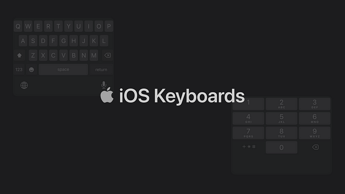
Apple has 10+2 keyboards for iOS, based on the content people will type. Using the right keyboard in the right place can make the users’ work easier, reduce friction and save time.
However, there is insufficient information about this, and sometimes designers/developers misuse keyboards. That’s why I decided to write this article. Let’s start.
1. Default
This is the most used keyboard type. For example, we use this keyboard when texting with someone. We can type letters, numbers, special characters, and emojis with it.

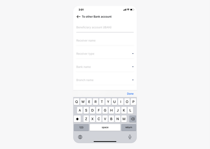
2. Alphabet
It is very similar to the default keyboard, but there is a difference. We cannot use emojis on this keyboard. We can only use letters, numbers, and special characters.
Use case:
- If you request data such as IBAN from your users, you can use this keyboard. Because there is no need for emojis.
3. Decimal pad
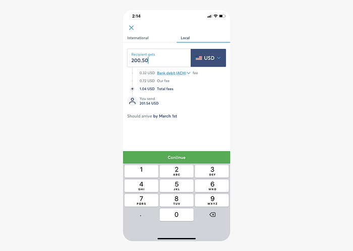
We can only use numbers and the “.” (period) character on this keyboard.
Use case:
- It can be used in the money transfer interface. So people can transfer pennies as well. For example, $200.50.
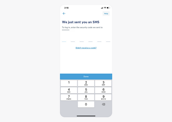
4. Number pad
We can only use numbers on this keyboard.
Use case:
- This keyboard can be used for PIN/number entry. For example, if your application has an add bank card interface, you can use this keyboard.
- You can also use this keyboard to enter the PIN code you send to the user for verification.
5. Phone pad
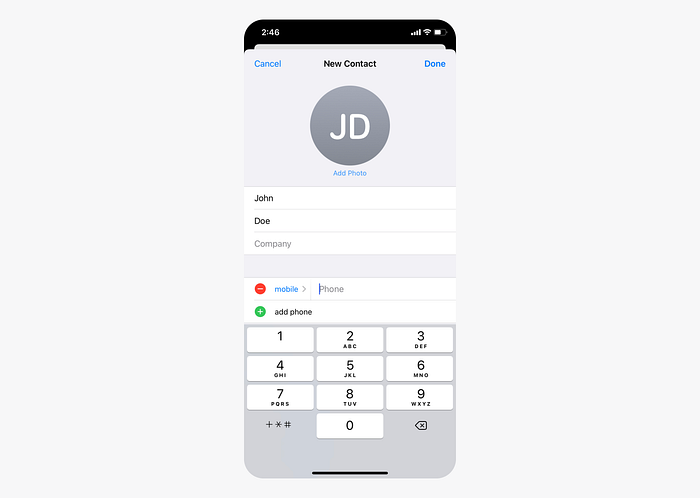
This keyboard is mainly designed for typing phone numbers. You can type these characters along with numbers: * , ; # +
Use case:
- You can add short numbers to your contacts with the special characters above and speed up your work.
6. Numbers and punctuation
This keyboard consists of numbers and special characters. It can be used for basic mathematical operations. This is a rarely used keyboard, and I have never seen a correct use in any product.
Use case:
- If you are designing an application for basic math operations, you can use this keyboard. However, it is not ideal for complex functions.

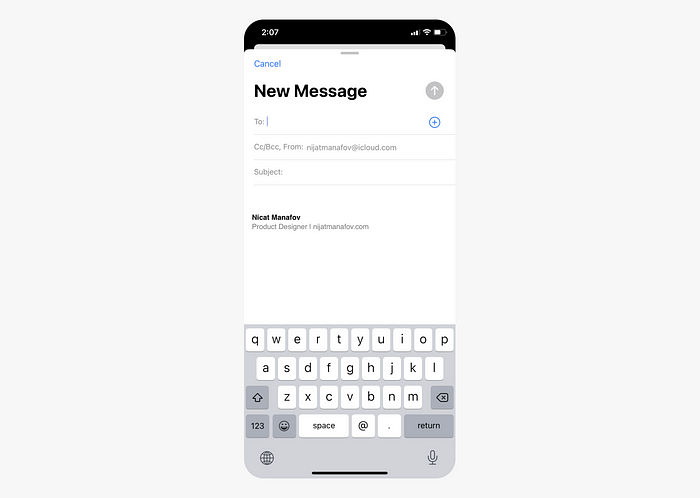
7. Email address
Since it is designed for typing e-mail addresses, “@” (at), and “.” (period) characters stand out.
8. Twitter
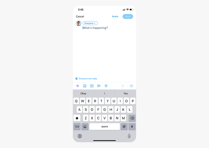
On the keyboard designed for Twitter, we see that “@” (at) and “#” (hashtag), characters, which are famous on the platform, stand out.
9. URL
This keyboard is designed for easy access to the “.” (period), “/” (slash) characters and the “.com” keys, commonly used in URL addresses.
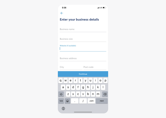
10. Web search
This keyboard is used when searching the web. The “.” (period) key are prominent. It also replaces the “return” key with the “Go” key.

ASCII Keyboards
By the way, iOS supports an ASCII keyboard that has letters, numbers, and special characters (But you can’t use emoji). There is an ASCII number pad as well. It looks the same as a standard number pad.
ASCII stands for American Standard Code for Information Interchange. Computers can only understand numbers, so an ASCII code is the numerical representation of a character such as ‘a’ or ‘@’ or an action of some sort. ASCII developed a long time ago, and now the non-printing characters are rarely used for their original purpose.
ASCII was actually designed for use with teletypes, so the descriptions are somewhat obscure. If someone says they want your CV, however, in ASCII format, all this means is they want ‘plain’ text with no formatting such as tabs, bold or underscoring — the raw format that any computer can understand. This is usually so they can easily import the file into their own applications without issues.
Use the keyboard layout guide in the design
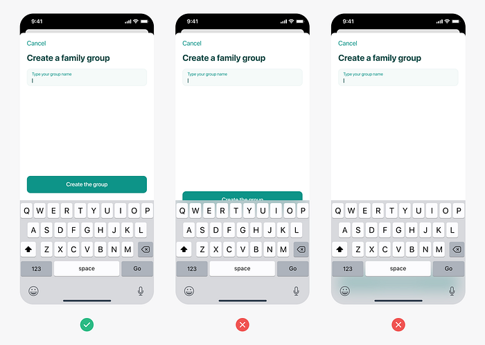
When using the keyboard, you should make sure that your design is appropriate. When the keyboard is active, it should never cover the design and we should be able to reach the inputs or the button.
For example, a button at the bottom of the screen should go above the keyboard when the keyboard is active.
Read more about: Layout Guides and Safe Areas.
